Glide
A Ski Shuttle Booking App


Client.
Glide concept
Tools.
Figma, Midjourney
Role.
UI/UX Designer
The opportunity
Getting to the mountain is often the most stressful part of a ski day. Parking fills up fast, and if you're relying on a shuttle, the experience comes down to waiting — standing in the cold with your gear, not knowing when the next one is coming or whether there'll even be a spot for you and your group. I ran into this in my own backyard. I spend part of my time near Park City, Utah, right where the new Deer Valley East Village is being built out, and this past season there was a real shuttle pilot running in the area that I got to use firsthand. Between the pilot existing at all and the scale of what's being built here, the need felt real, and about to grow. Glide is my answer: a mobile app that makes booking a shuttle seat as easy as the ski day should be. The bet is simple — instead of showing up and hoping there's room, you reserve your spot ahead of time. From wait-and-hope to book-and-go.
From interviews to wireframes
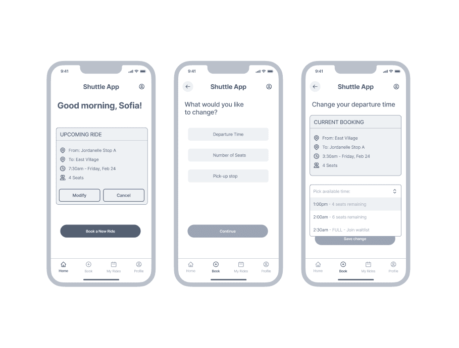
Before designing anything, I wanted to hear how people actually get to the mountain and where it goes wrong. I interviewed five people with different ski styles — a cost-conscious solo snowboarder who drives two hours each way, a parent planning trips for a family of five, a solo traveler who plans everything in advance, and locals living near the resorts. I kept the conversations focused on real behavior ("walk me through your last ski day, starting from when you left home.") That's where the honest pain points came out and the same themes kept surfacing: control and flexibility, real-time visibility, simplicity, group coordination, and the trade-off between cost and certainty. I also looked at how other apps handle similar problems — existing shuttle services, plus apps outside the ski world that nail time-slot booking and ride tracking. With the direction set, I mapped out the key journeys someone would actually take: booking a ride, viewing and tracking an upcoming ride, and changing or canceling one. I then put together low fidelity wireframes — so I could test whether the structure made sense before spending time on visual design. That turned out to be the right call: testing those early screens is exactly what surfaced the two key decisions that shaped the rest of the project.
Key decision #1: seats before time
My first booking flow asked people to pick a departure time, then say how many seats they needed. It seemed logical. But during testing, people kept pausing at the same spot — they wanted to know what was available before committing to a time. Choosing a time only to find out it couldn't fit their group felt backwards. It makes sense: how many seats are open depends on how many you need. So group size has to come first — the same order OpenTable and Instacart already use. So I flipped the order: pick your stop, choose how many seats, then see the times that can actually fit you. A quiet change, but it removes a moment of friction and second-guessing.
Key decision #2: designing for the moment plans fall apart
Key decision #2: designing for the moment plans fall apart Picture Sofia's family: five people, one booking, a 3:00 PM ride home. At lunch, her youngest is done for the day, so she wants to head back early with one kid while her husband and the others keep skiing. That isn't one change — it's splitting a booking in two, and there's a hidden trap. If Sofia simply drops her reservation from five seats to two, the app releases the original ride entirely. Her husband and kids have no way home, and she wouldn't find out until 3:00 PM when no shuttle comes. So I designed a warning that appears at exactly that moment, spelling out what's about to happen: this releases the original seats, and the people staying on the mountain will need their own ride. It turns a silent mistake into an obvious, fixable one and points her toward booking the second ride. The full guided "split your ride" flow stayed a future idea; the immediate risk got solved now.
UI built for cold hands
This app gets used outside, in winter, with gloves on and gear in hand. So the whole system is designed for a quick glance and a confident tap: big tap targets, as little typing as possible, ride cards that lead with the one thing you need — when you're leaving — and consistent patterns so nothing makes you stop and think.


A Style Tile with Figtree font
Highly legible at small sizes
Modern, premium and trustworthy
Headlines: Semibold/bold
Section Titles: Medium
Body Text: Regular